Building a Modern Website
9 min read
This is the first post in my new series where I write technical deep dives into things I’ve built. I plan on writing a combination of both tutorial (in case you want to build your own version) and rationale behind why I picked a certain architecture to solve a problem. In this post, I will be discussing the thought process and technology that went into building this website + blog.
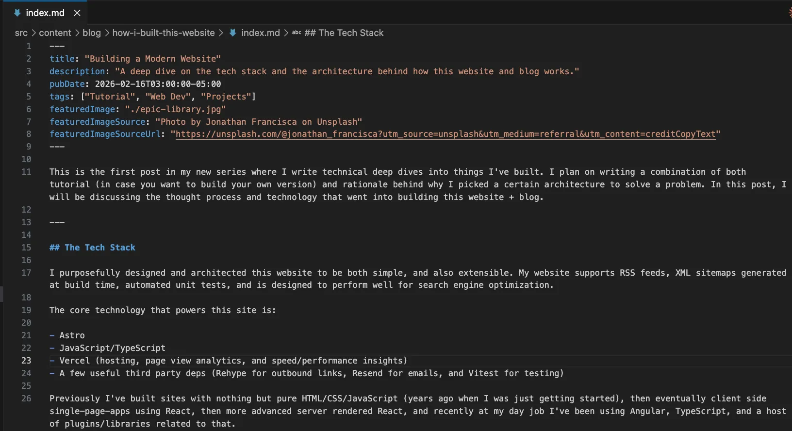
The Tech Stack
I purposefully designed and architected this website to be both simple, and also extensible. My website supports RSS feeds, XML sitemaps generated at build time, automated unit tests, and is designed to perform well for search engine optimization.
The core technology that powers this site is:
- Astro
- JavaScript/TypeScript
- Vercel (hosting, page view analytics, and speed/performance insights)
- A few useful third party deps (Rehype for outbound links, Resend for emails, and Vitest for testing)
Previously I’ve built sites with nothing but pure HTML/CSS/JavaScript (years ago when I was just getting started), then eventually client side single-page-apps using React, then more advanced server rendered React, and recently at my day job I’ve been using Angular, TypeScript, and a host of plugins/libraries related to that.
For this website I picked Astro because I needed a few things. Simplicity, speed (the site should be fast), built in support for image optimization (no need to send a 15mb image down the wire), and static site generation (90% of this site can be converted into basic HTML/CSS which can be served quickly and for cheap on any CDN or Edge server).
My blog, which I consider to be the capstone of this site, is my favorite thing I built. I have a simple script I can run npm run new-post and then provide title, description, and a few other details in the terminal, and then it auto generates a new folder for me. Inside this folder I can drag images or other assets for the blog post, and I have an index.md file which I can write new posts in markdown format.
Each markdown file for my blog supports custom metadata which drives the entire UI as you see it now. Below is a screenshot of the current post:
Site Architecture
This is the current architecture of my codebase. The “skeleton” of the site can remain as-is, but I can easily add new content by creating a new .md file in the /src/content/blog or /src/content/projects/ folders.
This means I can quickly publish new content by writing up a quick markdown file, push my code to GitHub, Vercel’s worker will see the new code, kick off an automated build, and deploy my site within a few minutes.
Then the metadata, tags, and content from the blog post markdown files will feed into my RSS, Sitemap, and SEO systems to set all of these up as needed for each post.
src/
├── pages/                     # File-based routing (each file = a URL)
│   ├── index.astro            # Home page (gavinshrader.com/)
│   ├── blog/
│   │   ├── index.astro        # Blog listing page
│   │   └── [...slug].astro    # Dynamic route for individual posts
│   ├── projects/
│   │   └── index.astro        # Projects listing page
│   ├── contact/
│   │   └── index.astro        # Contact page
│   ├── api/
│   │   └── contact.ts         # Server-side API endpoint
│   └── rss.xml.ts             # RSS feed generator
│
├── layouts/
│   ├── BaseLayout.astro       # Shared layout: SEO, header, footer
│   └── DemoLayout.astro       # Fullscreen layout for interactive demos
│
├── components/                # Reusable UI components
│
├── content/                   # Markdown content (Astro Content Collections)
│   ├── config.ts              # Schema definitions for blog + projects
│   ├── blog/
│   │   └── my-post/
│   │       ├── index.md       # Post written in Markdown
│   │       └── photo.jpg      # Colocated images (auto-optimized)
│   └── projects/
│       └── my-project/
│           └── index.md       # Project metadata
│
├── config/
│   └── site.ts                # Shared constants (site name, nav links)
│
├── styles/                    # Global CSS files
│
└── images/                    # Shared images

public/                        # Static assets (copied as-is to output)
├── robots.txt
├── favicon.svg
└── social-share-image.png     # Default Open Graph image
This is a pretty industry standard architecture, there’s nothing ground breaking here. But it works well, so there’s no need to reinvent the wheel!
SEO, Sitemap, and RSS Feeds
This is the boring “plumbing” which drives any modern site, it isn’t exciting but it is absolutely crucial to make your website discoverable and shareable on search engines! For sitemaps and RSS feeds I opted to use Astro’s built in libraries.
The Sitemap is handled entirely by @astrojs/sitemap, an Astro library which automates this process for me. With the addition of a few lines in your Astro config, your site will automatically generate a full XML sitemap at build time; this helps search engines discover all of your pages. Assuming you’ve set up your /src/pages directory properly (only including code you want converted into a URL route), you won’t need any additional custom code. Although I added a few simple customizations to my config to remove some pages which didn’t need to be indexed.
The RSS feed is also simple, using Astro’s @astrojs/rss library I can query my blog posts, and map them into the RSS feed:
// rss.xml.ts — generates /rss.xml
export async function GET(context) {
  const posts = (await getCollection("blog"))
    .filter((p) => !p.data.draft)
    .sort((a, b) => b.data.pubDate.valueOf() - a.data.pubDate.valueOf());

  return rss({
    title: SITE_NAME,
    description: DEFAULT_DESCRIPTION,
    site: context.site.toString(),
    items: posts.map((post) => ({
      title: post.data.title,
      pubDate: post.data.pubDate,
      description: post.data.description,
      link: `/blog/${post.slug}/`,
    })),
  });
}
I engineered this site around SEO; I want my blog to be discoverable on Google, as I post more content over time my site will gain “authority” (Google’s term) and show up in search results related to iOS engineering, or web development.
In order to build an SEO-performant site, I built a BaseLayout.astro component that every page is wrapped in. This component accepts props like title, description, image, and type, and then uses them to generate Open Graph tags, canonical URLs, and JSON-LD structured data for blog posts. Here’s a simplified version of how it works:
<!-- BaseLayout.astro (simplified) -->
<html>
  <head>
    <title>{title} · {SITE_NAME}</title>
    <meta name="description" content={description} />
    <link rel="canonical" href={canonicalUrl} />

    <!-- Open Graph -->
    <meta property="og:title" content={title} />
    <meta property="og:description" content={description} />
    <meta property="og:image" content={ogImageUrl} />

    <!-- JSON-LD for blog posts -->
    {type === "article" && <script type="application/ld+json">...</script>}
  </head>
  <body>
    <header>...</header>
    <main><slot /></main>  <!-- Page content goes here -->
    <footer>...</footer>
  </body>
</html>
Any page which is wrapped in the BaseLayout.astro component can pass in custom metadata. For example, an individual blog post template (like the page you’re currently reading) passes frontmatter (metadata tags at the top of the post) directly into SEO tags:
<!-- [...slug].astro — individual blog post page -->
<BaseLayout
  title={post.data.title}
  description={post.data.description}
  image={post.data.featuredImage}
  type="article"
  publishedTime={post.data.pubDate.toISOString()}
>
  <article>
    <Content />
  </article>
</BaseLayout>
With this setup, every blog post that I write automatically gets proper SEO tags, social sharing images, and structured JSON data all driven by the frontmatter tags at the top of each markdown file.
On top of this I have a few custom configurations setup in my astro.config.mjs config file. The markdown config automatically makes external links open in a new tab, and I have trailingSlashes set to always enabled to define one “true” canonical URL for any given page or blog post (helps SEO discoverability and indexing to have only one true URL route for a given page).
// astro.config.mjs (trimmed)
export default defineConfig({
  site: "https://gavinshrader.com",
  trailingSlash: "always",

  markdown: {
    rehypePlugins: [
      [rehypeExternalLinks, { target: "_blank", rel: ["noopener", "noreferrer"] }],
    ],
  },

  integrations: [
    sitemap({
      filter: (page) => {
        const url = new URL(page);
        const excluded = ["/mini-habit/", "/projects/neural-evolution/"];
        return !excluded.some((p) => url.pathname.startsWith(p));
      },
    }),
  ],
});
Dark/Light Mode and CSS Styles
I’m not going to touch on this too long, but a quick rundown. My site supports “OS level” light/dark mode, so whatever your operating system is set to, my website supports. This has been a long standing CSS feature, and I simply define a color palette at my global CSS file, and then depending on which color scheme is selected the palette is applied.
I also put a lot of care into testing the site on both mobile and desktop, the interactive simulations I coded also fully support both mobile and desktop. This is achieved using basic CSS breakpoints for different screen sizes, and responsive flex and grid layouts.
Most of my CSS is bundled so each page only loads the CSS it needs, and I opted to use just regular CSS (instead of SCSS or Tailwind) since it works well, is easy, and in general I try to avoid dependencies unless I have a compelling reason to use them. Standard CSS does the job for me, so I used it.
Here’s a trimmed version of how my global stylesheet defines a light/dark color palette — the same custom properties are used everywhere, and the browser swaps them automatically:
/* global.css (trimmed) */
:root {
  /* LIGHT MODE */
  --bg: #fdfdfd;
  --text: #1a1a1a;
  --tint: #0066d6;
  --muted: rgba(0, 0, 0, 0.6);
  --border: rgba(0, 0, 0, 0.18);
  color-scheme: light dark;
}

@media (prefers-color-scheme: dark) {
  :root {
    /* DARK MODE */
    --bg: #0d0d0d;
    --text: #e3e3e3;
    --tint: #4da3ff;
    --muted: rgba(255, 255, 255, 0.6);
    --border: #3f3f3f;
  }
}
Image Optimization
Image optimization is something worth spending your time on. By default if I added an image to my /public folder and just reference it via a basic <img> tag in HTML, the entire image would be sent down the wire. This means if you accidentally upload a 100mb image, you’re sending that entire 100mb down the wire. Not ideal if someone is loading the site via cellular.
This problem has been solved for years in tools like Next.js and now Astro, which provide built in <Image> components which intelligently serve up an image which is sized appropriately as you define it. Most of my images are limited to 1200px max (often less than this) which offers a reasonable trade off of both quality and file size.
Here’s how I use Astro’s <Image> component for the featured image on each blog post:
<!-- [...slug].astro — blog post featured image -->
<Image
  src={post.data.featuredImage}
  alt=""
  class="featured-image"
  widths={[400, 800, 1200]}
  sizes="(max-width: 700px) 100vw, 700px"
/>
Astro takes this and generates multiple optimized versions (WebP/AVIF) at 400px, 800px, and 1200px wide. The browser then picks the best one based on the viewer’s screen size, a phone loads the 400px version, a desktop loads the 1200px version.
Contact Form
My contact page is one of the few parts of this site that actually requires server-side routes. The form UI itself is basic HTML (statically rendered), but it posts to a server-side API route that handles validation, sanitization, and sends the email via Resend.
The contact form is designed to automatically defend against spam bots. I have an invisible honeypot field, which if a bot fills out (by filling out every available form on the page) the server sees the honeypot trap and sends a fake “success” response while actually discarding the submission.
<!-- contact/index.astro - hidden honeypot field -->
<div class="hp" aria-hidden="true">
  <label for="website">Website</label>
  <input id="website" name="website" type="text" tabindex="-1" autocomplete="off" />
</div>
On the server side, the API route checks this field first. If a bot filled it in, we redirect to the success page and move on. No email is sent.
// api/contact.ts - honeypot check
const honeypot = String(form.get("website") ?? "");
if (honeypot.trim().length > 0) {
  return redirect("/contact/?sent=1", 303); // Pretend success
}
For real submissions, the inputs get sanitized before anything else happens. Control characters are stripped out (this prevents header injection attacks), whitespace is normalized, and each field is clamped to a max length.
// api/contact.ts - sanitization
const name = sanitizeLine(nameRaw, 80);
const email = sanitizeLine(emailRaw, 120).toLowerCase();
const message = sanitizeMessage(messageRaw, 2000);
After that, the validated message gets sent through Resend’s API. The replyTo field is set to the sender’s email, so I can just hit “Reply” in my inbox to respond directly.
// api/contact.ts - send via Resend
await resend.emails.send({
  from: CONTACT_FROM_EMAIL,
  to: CONTACT_TO_EMAIL,
  replyTo: email,
  subject: `Contact form: ${name}`,
  text,
});
It’s a simple system that works well and lets people send me messages, while avoiding the army of bots actively scanning the net for undefended forms!
Conclusion
This post was a high level overview of the architecture I used, some of the important edge cases I had to account for, and some of the modern web standards I implemented. If you are working on a similar site, hopefully this points you in the right direction.
Thanks for reading!
Gavin